by Dave Blass, Perspective
What if Superheroes were real?
It’s a simple idea, which takes you deep down a rabbit hole of logic questions and design possibilities.
Suspend belief and what would the world be like?
Christopher Nolan’s Batman trilogy really changed the game for graphic novels. How did Bruce Wayne get the Batmobile and why wear a cape? Creating the backstory to these classic elements paved the way for the current “Era of the Superhero.” It took logical questions that people had glossed over for years and brought them into a tangible world. My first foray into the superhero genre was Roger Corman’s The Black Scorpion for the Sci-Fi Channel back in 1995. Whenever I would say, “Hey…this doesn’t make any sense,” the writer would always say, “Well, it’s comic book logic” and that would be it. But I wanted it to make sense, and I think fans do too. Enter The Boys, a new R-rated series for Amazon about a team of superheroes and the band of misfits who are working to take them out.
What if superheroes were real... Well, they would probably be egotistical jerks that would embody the idea of absolute power corrupting absolutely. They would be a Kardashian mixed with a pro athlete combined with a politician; capable of doing whatever they wanted. That was the idea at the core of Garth Ennis and Darick Robertson’s series The Boys. It was my third time taking a Garth Ennis project from page to television. I had previously designed Constantine and Preacher; Seth Rogen and Evan Goldberg also produced the latter. I knew with their guidance that the level of insanity would be pushed on every level. Showrunner Eric Kripke really pushed to ground the show in the present day. No future tech, no floating space stations, it was going to be just like a switch was flipped and the heroes were real. In our first meeting we talked about the realities, of the world building. There wouldn’t be any Batcaves or Fortresses of Solitude, it would be a business environment run by a megacorporation. Apple meets Marvel. The show’s Vought Corporation is part law enforcement and part advertising company. They rent out the superheroes to cities to solve their crime problems and add the marketing spin as well. The heroes would have their own movies just like Marvel and would be slapped on billboards hawking whatever they could sell. The offices had to be slick and unique. I didn’t want to go futuristic, it had to feel like Vought had just called up Zaha Hadid or Santiago Calatrava and threw a ton of money at them for the tallest, most forward-thinking building in New York.
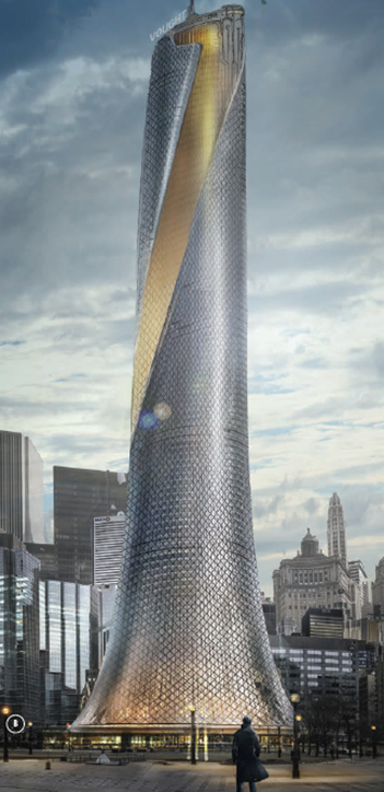
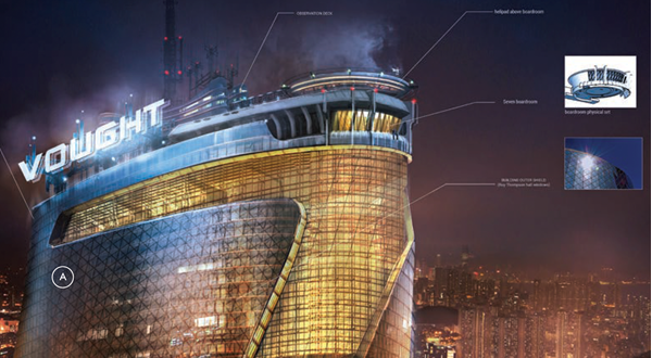
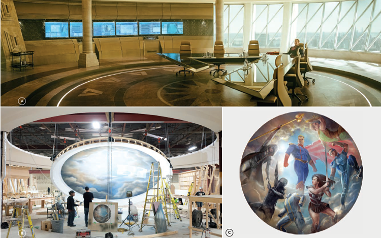
I always approach my designs based on reality. One can design whatever they want, but if it is unaffordable or has limitations that can’t be met on a TV schedule or budget, then they have put themselves into a corner from the beginning. I knew it would be necessary to go in and out of a practical building, and that would really set the tone. Several weeks were spent looking at possible venues but nothing was found that really worked. Then one night I was driving past Roy Thomson Hall, all lit up and I knew that was our spot. It had been crossed off the list early because of its association to X-Men, but I thought it deserved a second look. For me, the logic worked perfectly. Of course, the audience would believe that superheroes could work in this building. They had ALREADY seen superheroes here and accepted it. All of the show’s heroes were a satirical version of other heroes, so its locations could be too. I worked with Concept Artist Henry Fong who created an epic phallus that spiraled to the heavens and turned into a giant “7” at the top to symbolize the seven superheroes.
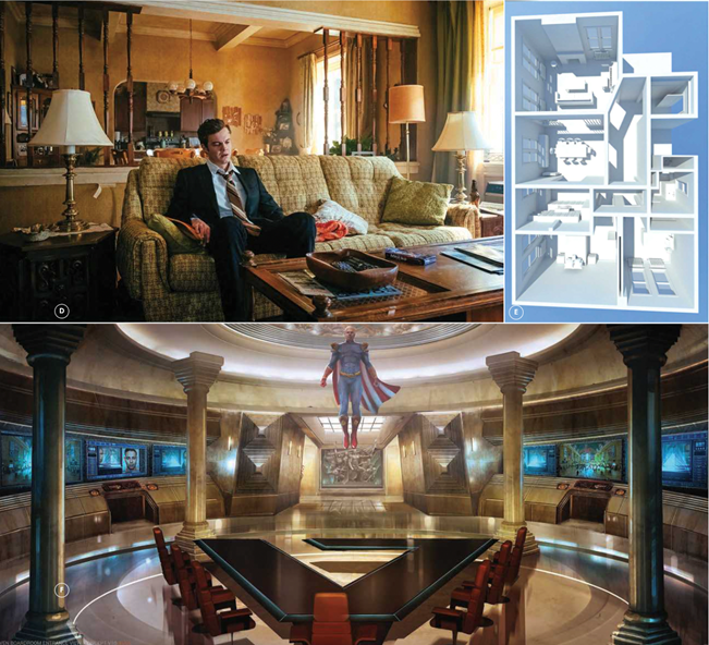
Once I had landed on the starting point for the architecture, I knew that the building could be twisted and changed. The penthouse area would house the boardroom of The Seven. They are the seven top superheroes in the world, brought together to protect America. I wanted their space to be bold. It wanted to play to their egos. I looked to Hollywood and Washington for inspiration. What do the homes of the rich and famous look like, and what do they have in connection with the White House? The idea was that sycophants catering to their every whim would surround these heroes. Stroking their egos. There would be statues and murals to celebrate their godlike abilities.
Working with Henry Fong, a round colonnade with a massive floor to ceiling vista of New York City was created. I would like to say that the Doric columns were a stunning design choice, but they were a simple necessity. The set would be built in an old warehouse with support beams every twenty feet, so something was needed. Rather than running from it the issue was embraced. The view of the city would be an issue as well as two of the structural columns would end up right outside the windows. Henry came up with this wonderful swooping column detail that not only hid the posts but also added a beautiful foreground element to break up the massive backdrop.
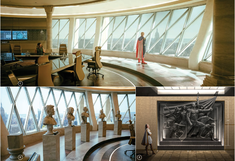
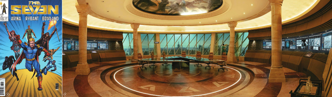
While designing the boardroom, the graphic design team headed by Paul Greenberg had the epic task of creating…Epics. They needed to create marketing campaigns for seven superheroes. Movie posters, billboards, magazine covers and lunch boxes, all would be needed. Anything one could slap a sticker on. The tiny graphic design team had to churn out the entire Marvel franchise worth of artwork in a matter of months. Each hero had their own branding that had to be unique to them, but also work in conjunction to the rest of the group. Homelander was the all-American Superman-type character, Queen Maeve was the Amazonian warrior, The Deep, an aquatic superstar, A-Train was the show’s speedster, Black Noir was a bit of a Batman meets ninja, Starlight was the newest to the group, with her Midwest cheerleader charm, and Translucent the invisible man. The final hero was Lamplighter. In the story, Lamplighter is being replaced by Starlight, so he is never seen in the show, which was great for everyone except the Art Department. For us, he was like a retired superstar. Every image of The Seven that would be seen in the set would need to include this character…who wasn’t a character. No need to cast an actor or design wardrobe, or at least not a priority. It was for us, however. I had to beg with costume designer L.J. Shannon to work with us on an outfit design that we could use. They created a rough hooded figure with a flowing jacket concept that we took and ran with. From there, Henry Fong took the look they sketched and brought it to life. He had already created a stunning 14-foot-tall sculpture design of The Seven, and we chose to put Lamplighter in the back to hide him as much as possible so we could develop the rest. It was all coming fast and furious at this point. While one group was working on the sculpture, another was doing giant 23-foot domed fresco of The Seven that would hover over the room, and the hero statues were being hand sculpted by Greg Aronowitz based off of early concept art and photos of the actors. We still had no idea what the actors would look like in their costumes. Thank goodness Translucent was invisible, because he wasn’t cast at this point, so every piece of art just became an empty jumpsuit. The pace was near insanity.
At the center of the room would be the boardroom table. Always a tricky piece of furniture as something custom and unique is needed. Is it round, is it rectangular? How is the power divided between the individuals at the table, are they equal or is there a power division? (And seven is an odd number.) In The Seven, it was clear that the character Homelander was the leader and let everyone know it. I thought about a V-shaped table with him at the apex with three other members on either side. It would give the room a strong presence and all of the actors would have the skyline as a background. The table would be almost superheroic in its design, a giant 17-foot glass and steel structure that cantilevered from the base where Homelander sat. While designing it, we landed on a logo for Vought and The Seven which was a combination of V and 7 that took me to the next level of self-indulgence, and the whole table was turned into the Vought logo. It was massive and elegant at the same time.
For the backing, I called Phil Greenstreet at Rosco to help us with a day/night Softdrop. I have used these on my past six shows, and they have been a game changer in terms of speed and efficiency. One large 120x22 foot panorama of New York City was created, along with smaller 8x22 foot backing from a slightly different direction for one the of the executive offices. There were weeks, not months to get it done and I still can’t believe it happened in time. A Google Earth scout of Manhattan was used to pick a rough location for the building, and Phil and his team did the rest.
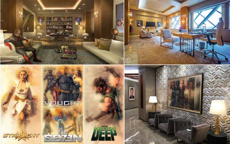
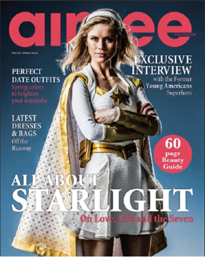 The Vought complex needed a few more sets. First was Stillwell’s office. She was the CEO of Vought who would interface and ‘control’ the superheroes. She was part studio executive, part agent. Showrunner Eric Kripke was keen to make her seem as real as possible. No crazy architecture. He wanted it so grounded that we put a crib in the corner of the room, as her character was a single mom with an infant, and she might bring the child to work. The walls were filled with the graphics team’s creations. Posters of the heroes, framed movie posters and a stunning portrait of Homelander that looked like it came right from a Zack Snyder film. This office flowed into a grand “walk and talk” hallway lined with more marketing artwork. The Art Department was able to get the actors in costume for one 3-hour photo session where we were grabbing them in every possible position to use in ads, posters, newspaper clips and anything we could think of. I put in a call to Darick Robertson who created all of the artwork for the original graphic novels. He created ten custom pieces for the show based on the original book covers, but with the shows’ actors integrated into the artwork. These were framed and lined the hallways as part of the Vought marketing collection. The “Real Life Adventures of The Seven.”
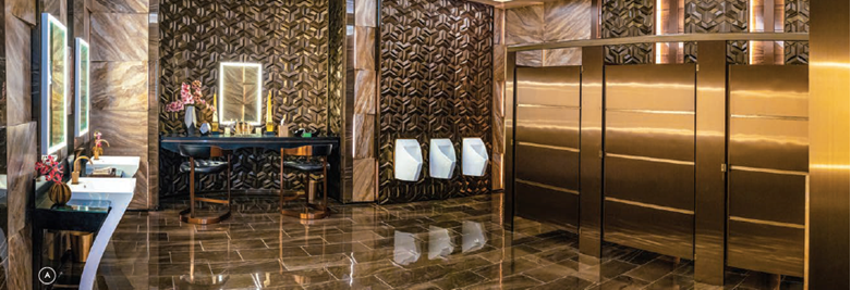
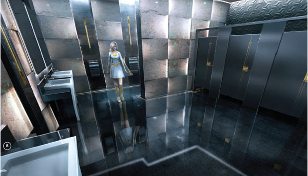
At the end of the long hallway was the one of the most unique sets I have had the chance to design. There have been many designs for superhero lairs, but I got to design the first superhero bathroom. The script called for two scenes in two bathrooms, but we were tight on space. I pitched the idea that these were powerful personalities and since there was only one female member of The Seven, she wouldn’t give the guys the satisfaction of being shy. A grand unisex bathroom was designed with jutting marble panels with LED accent lights. Set decorator Cheryl Dorsey found amazing pedestal sinks in the shape of a 7 that worked perfectly to set tone. The stalls were designed to mimic the massive door in the boardroom, and the stalls included an amazing “Cape Clip” that would hook onto the cape and automatically pull it up so the person could sit and do their business. Sadly, they never got a chance to get used.
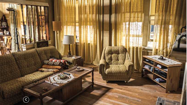
Oddly the hero of the show isn’t a superhero at all, but a mere mortal named Hughie Campbell. In the comics, he was drawn to look like Simon Pegg, but that was twelve years ago, and Simon was too old to play Hughie, but was perfect casting for Hughie’s dad. For the father and son pair, a Brooklyn apartment was designed that juxtaposed against the steel and glass of Vought Tower. It had a vintage 1970s retro feeling, like the family had wanted to upgrade but never gotten around to it. Old turned spindles divided the living room from the dining room and wood tones and faded wallpaper helped set the tableau of the home of an unlikely hero.
 Dave Blass, Production Designer
Mark Zuelzke, Supervising Art Director
Dean O’Dell, Art Director
Adriana Bogaard, Assistant Art Director
Jeff Smith, Sylvain Bombardier, Barbara Agbaje, Dwight Hendrickson, Leks Raamat, Anna Lupi, Set Designers
Henry Fong, Illustrator
Paul Greenberg, Pearlamina Cheung, Graphic Artist Alex Lyons, Barton Rendulic, Storyboard Artists
Cheryl Dorsey, Set Decorator