Above Image: FOREST PORTAL. SCALE MODEL BY BILL BOES.
by Bill Boes, Production Designer & Suzette Ervin, Art Director; ADG Perspective
Nature was an ever-occurring theme through the design of Upside-Down Magic, and we were constantly thinking of how to incorporate the natural building materials around us.
As we look back at the start of the project, when Bill first received the phone call to interview for Disney Channel’s Upside-Down Magic, he remembers thinking: “This is a movie for kids and not what I want to do creatively.” But after reading the script about a magic school and how students with unconventional powers are susceptible to a dangerous and evil “shadow magic,” he realized it was exactly the opportunity he craved to infuse with his slightly bent and surreal artistic sensibilities. “A flood of images came to me as I read about the dark undercurrent of the movie. I started sketching feverishly and ended up with a scope of drawings and enough images to fill a cauldron.”
The story itself is based on two best friends, Nory (Izabela Rose) and Reina (Siena Agudong), who discover they have magical powers at a young age. They are recruited to the Sage Academy of Magical Studies, where Nory’s powers as a Fluxer (an ability to turn into animals) is labeled as wonky, or upside-down, while Reina is an Honors Flare (she can manipulate flames).
When we got to Vancouver, we were on an abbreviated preproduction schedule, so Bill decided we would divide and conquer. Bill focused on all of the fantastical sets, and Suzette took on the all the real-world sets that would match seamlessly to the exterior location work like the protagonists’ neighborhoods and bedrooms. We have a shorthand that works well, so this part was easy.

A. KYLE HOWARD AS BUDD SKRIFF IN FRONT OF THE FOREST PORTAL. PRODUCTION STILL BY DISNEY CHANNEL/EIKE SCHROTER.
B. SAGE ACADEMY RENDERING BY BILL BOES.
C. MOOSE SCULPTURE. SET PHOTO BY DISNEY CHANNEL/EIKE SCHROTER.
In the original script, when the students were traveling through the forest on their way to Sage Academy, there was a mysterious, large and ominous stone gate, the magic portal to the academy beyond. Concept artist Ricardo Sandoval tried numerous beautiful designs, but ultimately, it felt as if this was a concept seen before in many films. We pitched a few esoteric concepts to director Joe Nussbaum who was immediately drawn to a reference image of sculptures made out of twine and wood. With new illustrations by Ricardo, and with this new direction, the Art Department built a small model of a brand-new portal concept, made only from organic materials in a vortex swirl shape, which, in the end, embodied the theme of Sage Academy.
Once the design was approved, a full-sized armature was made out of chicken wire and plywood on which to attach the twigs and branches. This sequence was shot in an environmentally sensitive forest in North Vancouver and the production was given strict guidelines regarding the materials we could bring into it. We made the conscious decision to ask and gain permission to gather the building materials needed from the forest floor—fallen tree branches, twigs and other natural, organic building materials. This set was constructed almost entirely from recycled materials from the immediate area, and once shooting was over, the portal set was dismantled, and the materials returned to the environment from which they were harvested.

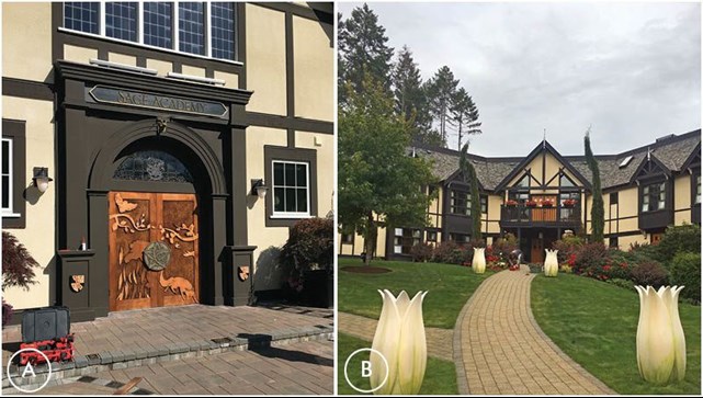
A. SAGE ACADEMY DOORS. SET PHOTO.
B. FLARE DORMITORY WITH TULIP LIGHTS. SET PHOTO.
Nature was an ever-occurring theme through the design of Upside-Down Magic, and we were constantly thinking of how to incorporate the natural building materials around us. The location selected at Shawnigan Lake School on Vancouver Island was perfect both for shooting, as well as for its proximity to nature. Bill recalls, “As a child, I built complete environments out of the materials I found on the beach—driftwood, twigs and stones. Designing Upside-Down Magic helped me relive those experiences and harness those sensibilities.”
The campus came to life with organically sculpted features and animals. We added an array of carved tulips and flames for practical lighting throughout the grounds. We had a lot of fun with the animal “abominations,” the whimsical creatures Nory fluxed into. For instance, when she was supposed to turn into a tabby kitten, she transformed into a “dritten,” a half dragon, half kitten. Topiaries were built that Nory is instructed to prune as her penance for getting it all wrong. In addition, real animals (goats, llamas, etc.) made being on location a literal zoo.
For the corridors of the school, we incorporated several striking and beautiful murals done by talented Vancouver artist Pilar Mehlis as wallpaper. This was instrumental in tying the set builds to the location interiors. We also had help from local art curator Darryl Stapleton, who was invaluable to us and the decorating team.

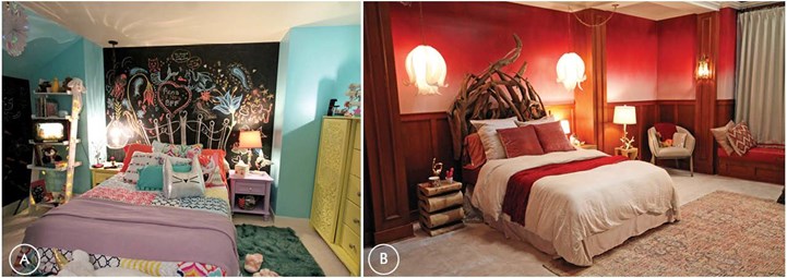
A. NORY’S BEDROOM. SET PHOTO. B. REINA’S DORM ROOM. SET PHOTO.
The introductory sequence of the movie is a low-flying drone shot skating through the streets of Nory’s neighborhood and right into her bedroom window. She is seen as a young girl and has just moved into the house. We knew from the forecast the day of shooting that it would probably rain, but there was no place to move this day in the schedule. There was a great shot planned of kids drawing a chalk mandala on a driveway that the camera swoops down and pans over. The night before, Suzette and the painters decided to use chalk paint on canvas, making it look like an asphalt background, which was then cut out and laid down. Artists and chalk were on standby just in case the sun showed up at call, but the weather demanded the pre-painted canvas and it worked beautifully, with the rain and overcast sky adding a foreboding to the opening that was absolutely made to order.
The script revisits Nory’s room when she is older and developing her magical powers. To illustrate her creativity and uniqueness, we thought she would like to draw on her walls, including her headboard. Several of the walls were painted with chalkboard paint to help Nory tell her personal story.

A. UPSIDE-DOWN MAGIC CLASSROOM. DRAFTED ELEVATIONS BY PETER STRATFORD.
B. UPSIDE-DOWN MAGIC CLASSROOM. COLOR WALL ELEVATION BY PETER STRATFORD.
C. UPSIDE-DOWN MAGIC CLASSROOM. SET PHOTOS.
After Nory arrives at Sage Academy, she is labeled as having upside-down magic and is sent to the UDM classroom. The design for the classroom itself came from a conversation with the director where he asked if we could make it feel as if it smelled bad. Bills response: “Why yes Joe, visually, for sure we can.” He wanted the space to feel like an underground bunker that no one would ever want to go into. Through a mold covered door, down a precarious staircase, the students would encounter a classroom built from concrete, with roots wrapping around the walls and strangling the life out of the environment. A small water sewer was added to the space, so the flickering light raked upon the walls would help suggest the “smelly environment” Joe requested.
Bill had a great collaboration with director of photography Adam Santelli in creating the right emotional vibe. Light wells and grilled vents were incorporated to project light through and a gallery in the background suggested an endless set of tunnels beyond.
The scenery was built on a giant open warehouse stage. Plenty of room until you put eight large sets, a mill, a video village, cameras and craft services in it too! We pushed and pulled our budget until we were able to get exactly the creepy ambiance it deserved. A repurposed circular stairwell provided the descent underground to the classroom, with layers of set dressing as varnish.

A. & C. UPSIDE-DOWN MAGIC CLASSROOM. SET PHOTOS
This brings us to the other protagonist, Nory’s best friend Reina, whose dorm room and classroom couldn’t be more different. We needed to tie the dorm room into the exterior on location, so we knew what one wall would look like. We gave the window ledge the depth of a thick masonry wall and then added a window seat. Joe wanted Reina’s room to reflect her superior position in the school, and the prestige students like her were given (over the UDM kids) without going overboard. We needed to relate it to the interiors of the school, as well as differentiate it from the dorm rooms in another Disney Channel Original Movie, Descendants.
To make it different, we lowered the dado and made a graduated paint treatment for the walls in alizarin crimson. We continued our organic driftwood sculptures for the headboard and desk. It was very effective in a subtle but “menacing antlers are scary” kind of way.
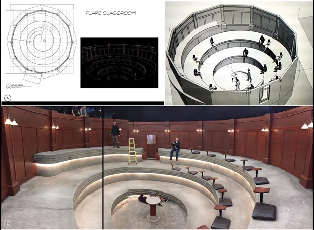
While scouting, the production team insisted that the film use one of the many spaces on the campus for the Flare classroom, where Reina honed her powers. Obviously, this would have been convenient and fit into the perfect schedule. “But…” Bill notes, “I knew that this being exactly where the story divides (from good magic to shadow magic), it really had to be something special. I wanted the space to reflect the idea of centrifugal force when you picture an object internally combusting and the explosiveness of a flame to fire. I started drawing circles and realized we had to build this classroom.” In stark contrast to the UDM classroom, it had to ascend, so the cylinder classroom with it ascending ramp was born.

A. FLARE CLASSROOM. FLOOR PLAN DRAWN BY PETER STRATFORD.
B. FLARE CLASSROOM. SKETCHUP MODEL.
C. FLARE CLASSROOM IN PROGRESS.
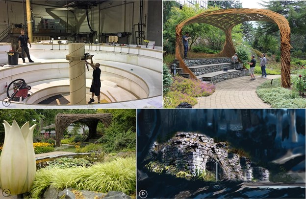
The concentric circle concept for the Flare classroom came from a conversation we had with director Joe Nussbaum, about the idea that matter is always moving, that magic is trying to contain itself, and fire is an energy the students are training to contain. The shape came directly from nature, and we wanted to show it visually. To build this set, construction coordinator Scott Wellenbrink took a very Leonardo da Vinci approach on how to project all the concentric lines. Assistant Art Director Peter Stratford drew an impressive set of drawings that should be framed in a museum, but this was only the beginning. Wellenbrink started with a slab of four-foot Styrofoam and slowly projected his cuts along a slow, concentric, ever-decreasing circumference until he reached the stage floor; it was a marvel to behold. It felt as if he was sculpting a giant sea snail shell. The center of the set housed a large cylindrical post, which was pegged for each level with its corresponding altitude as it descended to the stage floor.
The third and final classroom created, the Fluxer classroom, was a particular challenge, as we had only days to construct and limited funds in the column of this line item. The production’s skilled greensmen and artisans sculpted and trained vines to create the exact drawing Bill gave them.
The transformations of the Fluxer kids (into kittens, sheep, etc.) was the last shoot day on set. It was a kick having the live animals back. We were all a little sad when the last shot was finished. It is always a joy working together, and it was really rewarding working with our collaborative producers Suzanne Farwell and Susan Cartsonis and the super energetic and creative director Joe Nussbaum. ADG

A. FLARE CLASSROOM UNDER CONSTRUCTION.
B. FLUXER CLASSROOM. PHOTOSHOP ILLUSTRATION BY BILL BOES OVER LOCATION PHOTO.
C. FLEXER CLASSROOM WITH STYROFOAM TULIP.
D. SPOOKY GATE. EARLY CONCEPT ILLUSTRATION BY RICARDO SANDOVAL.
Bill Boes, Production Designer
Suzette Ervin, Art Director
Peter Stratford, Assistant Art Director
Nathan Carlson, Graphic Artist
Cory Warren, Set Decorator