by Lauren Wicks, Veranda
We chatted with the production and costume designers from Lee Daniels's Golden Globe-nominated film.
The life of the legendary jazz singer and activist Billie Holiday may appear to have been a glamorous one, but Holiday’s life was far from perfect. From an early age, it was riddled with pain and trauma, and she lived to be only 44 years old. However, in her short time on earth, she heavily influenced jazz and pop music and became an early face for the civil rights movement, and her unique voice and timeless songs continue to inspire more than 50 years after her death.
Holiday’s life is uniquely chronicled in Lee Daniel’s new biopic, The United States vs. Billie Holiday, debuting February 26 on Hulu. The film has already received widespread acclaim, with Andra Day, who portrays Holiday, up for a Golden Globe nomination for Best Actress. We chatted with the film’s production designer, Daniel Dorrance, and costume designer Paolo Nieddu, about re-creating Holiday’s world full of juxtaposition—from glamorous moments in Carnegie Hall to dark days in a jail cell.
DESIGNING BILLIE
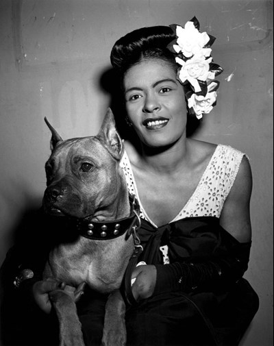
The real "Lady Day" and her beloved Boxer, Mister, 1940
Both Nieddu and Dorrance sing the praises of director Lee Daniels and his creative vision—along with the star power of leading actress Andra Day. Nieddu says simply putting Day in a blouse reminiscent of Holiday’s style made him feel like he was in the presence of the celebrity herself.
“The first thing I jumped on was coming onto the feel and color of the movie,” says Dorrance. “I Photoshoped this image for Lee of late-1930s New York City that had been colorized, and it had just the right tone and feel, color-wise. Then I took a shot of Andra, who dresses in a retro fashion anyways, and put a fur coat on her and an umbrella in her hand. We printed posters of that shot and put them in everyone’s office to show this was the feel we were after.” Daniels loved the image Dorrance created so much that he ended up finding a spot for it in the movie when she walks in the rain with her dog in a fur coat.
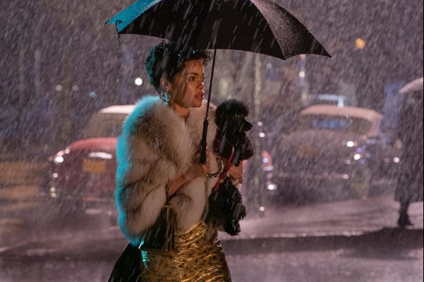
Meanwhile, Nieddu’s team was busy collecting 1930s and '40s vintage pieces from L.A. to Montreal (where the film was shot) and began using them almost as samples to find the right silhouettes from the period for Day to portray the iconic songstress.
“The film takes place in 1947 through 1949 and then in the late '50s, which are such beautiful times in clothing history,” says Nieddu. “Then to tie in the jazz scene and venues she performed in....It was such a cool time, and the research came from a lot of magazines and designers of the periods.” Among some of his favorite sources of inspiration were Look and Life magazines.
Nieddu spent many of his early research days combing through the Library of Congress and Google Images looking through pictures of the singer at various events and getting a feel for what her closet would have been like. Pulling from motion picture costume wardrobes, 1stDibs finds, among other pieces, he helped create an authentic closet that would have represented beloved items Holiday may have held onto from the '30s to avant-garde looks that would have been ahead of her time.
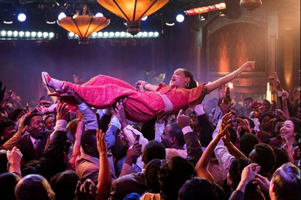
“One of the most fun outfits for me was the orange sequin pants and shirt that she performs in when she’s crowdsurfing,” says Nieddu. “We really haven't seen a period movie show a performance in that way, and this one just captures this playful spirit of Billie. I was inspired from a vintage top I saw from the '30s and wanted to mix in things that would have been favorite pieces from younger years. Also, the black dress she wore to perform at Carnegie Hall was such a triumphant moment for her in the film, and Andra just radiates in that strong shape. The dress had such a presence but was understated enough to allow her to shine through.”
A WORLD OF PENTHOUSES, JAZZ CLUBS, AND JAIL CELLS
Dorrance and his team had their hands full with The United States vs. Billie Holiday, having to re-create everything from Manhattan’s iconic Cafe Society to austere jail cells and court rooms.
“It took lots of internet searches and looking through books to find the obscure stuff—not the everyday—and molding it into the locations you’ve chosen,” says Dorrance. “That’s the fun of any film: the learning of your subject, and it’s amazing to relearn the history of this time and take it further.”
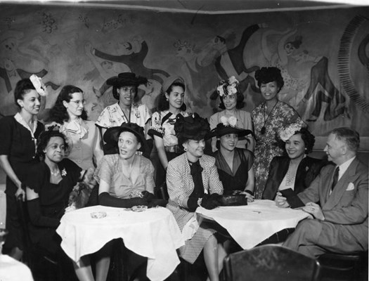
An NAACP gala at Cafe Society, circa 1950s
Boards were created of each subject matter, from swanky venue interiors to hospital rooms, leading to 40 in total, with nearly 100 images on each, before Dorrance chatted with Daniels about his vision and rounded up set decorating, props, costumes, and photography for the look and feel of the film.
“One thing we discussed early on was wall color, and in terms of darkness, we wanted to go a lot darker on the walls than one normally would, for things to fall off into the abyss in a sense,” says Dorrance. “Every light brought in—the bulbs and temperature—were all discussed prior to each scene, as the look of the movie was to go darker, especially with all the nighttime and drug scenes. The opulence of it all doesn’t want to pop or necessarily grab your eye.”
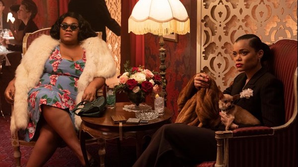
The team spent hours combing through vintage wallpapers, for example, that were evocative of the time period but also melded into Holiday’s increasingly darker world. Dorrance says with every location or detail added, he wanted it to have an aura of opulence, be it in her Cafe Society dressing room or the place she feeds her drug addiction. Cafe Society was the one set his team was able to build from the ground up with the venue’s slogan in mind as the main inspiration: “The right place for the wrong people.”
“This was one of the first clubs where there was intermixing on the main floor of Black and white,” Dorrance says. “The owner wanted diversity and that’s what his motto was, and he put it on the exterior of the club. We did our best re-creation of it because there were actually two locations—one uptown and one downtown—and combined parts of both for this one space. Finding photos was really difficult because it wasn’t well documented and we could never find a single photo of Billie actually singing there.”
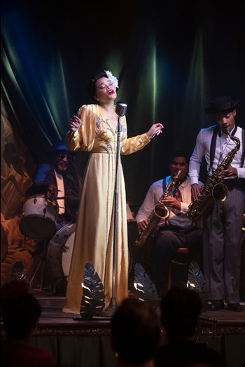
Based on Dorrance's design concept, Nieddu and his team came in with sketches and designs of what they imagined patrons from Harlem would have worn and what would be in the pages of Life during that period. These scenes at Cafe Society all speak Billie’s widespread adoration alongside FBI probing, suffering from a severe drug addiction, and the challenges of rampant segregation. Throughout the entire film, we watch how she fought to keep it together for her fans nearly every night, along with how she used her spotlight to shine a light on injustice at these iconic venues, even if it led to serious consequences that kept her life from being as glamorous as it seemed.
“We tried to find locations with that sense of opulence of the time but downplayed it a little bit, depending on color and by aging the walls. That was the overall thought for the movie: to give that presence everywhere you went and to put Billie in the middle of that. She had, in theory, the wherewithal to be in the right space. She was floating through this world of beauty but there was so much darkness that she lived with. She was always fighting the world wherever she was.”