by Todd Fjelsted, Production Designer; ADG Perspective
It’s a rare moment when you discover that two of your lifelong obsessions, comic books and gothic horror, are going to merge within a single project. While reading the treatment for Marvel’s Helstrom, I instantly saw its simple, everyday gloom and its quiet fury born of trauma. I saw its strange family history woven into every frame and its visceral jabs at old wounds. Its cold stone, burnt wood, and shards of iron and bone, all brimming with a macabre wit. Now I just had to convince the producers that I understood the tone and aesthetic they were seeking because Helstrom was to be Marvel Television’s first foray into horror, requiring both a familiar approach and a unique visual style.
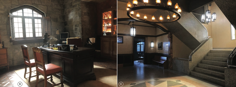
A. (HEADER) SAINT TERESA’S CENTER FOR MENTAL HEALTH, EAST HALL. THE LAYOUT WAS DESIGNED WITH CONNECTING CORRIDORS TO ALLOW FOR WALK-ANDTALKS WITH DR. HASTINGS AND HER PATIENTS, AS WELL AS MULTIPLE STUNTS AND FX SCENES. SET PHOTO.
B. DR. HASTINGS’ OFFICE WHERE SEVERAL THEOLOGICAL DISCUSSIONS TOOK PLACE. SET PHOTO.
C. SAINT TERESA’S ENTRYWAY AND LOBBY. THE HANGING STAIRCASE WAS BUILT TO MATCH A LOCATION. SET PHOTO.
The interview was set and I jumped into action, pulling imagery and assembling mood boards. But showrunner Paul Zbyszewski had a different approach to hiring his designer and did not want to see my mood boards, not just yet. He instead grilled me on the nature of horror. “What films do you think are the scariest ever made?” he asked almost immediately. “The Exorcist, Rosemary’s Baby, The Shining and The Omen” I answered without hesitation. “Why?” he retorted. As a horror aficionado since childhood, this was a subject I’d thought about for many years. “Because there’s nothing more terrifying than an evil within your own family. When the people you trust more than anyone turn on you, and you’re forced to battle them for your own survival. To me, that’s the scariest kind of story.” He laughed and said, “Well, that’s exactly the kind of story we’re going to tell.”

D. SAINT TERESA’S CENTER. ENTRANCE SIGN BY ASSISTANT ART DIRECTOR SEAN GOOJHA. SET PHOTO.
E. FLOOR PLAN FOR SAINT TERESA’S LOBBY, PATIO, CORRIDORS, OFFICES, PATIENT ROOMS, WAITING ROOM AREA, AND SECURE WARD. DRAWN BY LEAD SET DESIGNER JORDAN MEYER.
In the 1970s, Marvel Comics writers ventured into horror territory with characters like Ghost Rider, Werewolf by Night and Dracula—successful monster titles that made the writers want to take on the biggest baddie of all: Satan himself. So, to avoid the potential backlash of depicting demons as heroes, Stan Lee suggested a more palatable version: The Son of Satan. As the offspring of the devil and a human mother, Daimon Helstrom and his sister Satana would fight against the forces of evil, using their own half-dark natures and inherited powers. The occult siblings were a hit, soon sharing stories with Ghost Rider, Dr. Strange, Blade and other superheroes whose powers held mystical origins. By the 1990s, the characters became more realistic: Daimon’s red cape and yellow boots became denim jeans and Doc Martens—though the glowing pentagram burned into his chest (a scar from the wound carved by his father) and the trident forged from hellfire well, those remained. Satana, on the other hand, seemed to embrace her evil side, using her deadly powers as a succubus to exact bitter revenge on those who harmed the innocent.
Cut to 2020s version of the Helstrom family, greenlit as an hour-long horror drama at Hulu, known for elegantly rendered cautionary stories like The Handmaid’s Tale. How would these characters, and the worlds they inhabit, actually work in a grounded, live-action format? At its core, the answer was simple: as a dark family drama. But getting the audience to take this journey into demonic possession, strange powers, and a clandestine network of ancient evil—with or without an awareness of the comic book origins— was going to be a visual and tonal challenge.
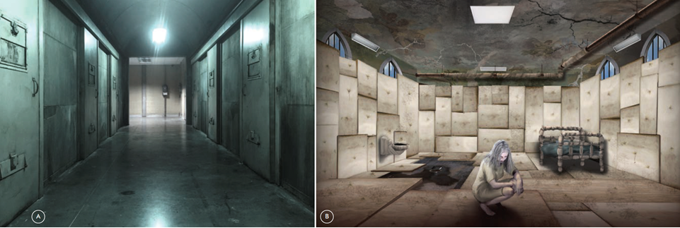
A. SAINT TERESA’S CENTER. SECURE WARD HALLWAY. SET PHOTO.
B. SAINT TERESA’S CENTER. MOTHER’S ROOM, A FORMER CHAPEL WITH RENAISSANCESTYLE CEILING MURALS, REWORKED INTO A PADDED CELL. CONCEPT ART BY JAIME GERVAIS.
The writers set the primary story in Portland, known for its cloudy gray skies and gloomy, atmospheric chill—a good match for this fall/ winter Vancouver shoot. As in the comics, Victoria Helstrom, the human mother of Daimon and Satana (now just ‘Ana’) has been institutionalized for twenty years, having gone mad after discovering her husband’s true identity. Of course, her madness was not your everyday version, nor was the institution that contained her.
Saint Teresa’s Center for Mental Health was to be the first big build: an old nunnery now functioning as a specialized catholic hospital led by mysterious former nun, Dr. Louise Hastings. This backdrop allowed for some darker gothic flourishes. For Saint Teresa’s gothic façade the production used a 1930s stone and mortar building on a nearby campus, built to house the theology department. The stage build of Saint Teresa’s main floor featured corridors of dark wood arches, polished linoleum, stained-glass transoms, antique church hardware and vintage reproduction light fixtures. The set housed various types of patients in its many rooms and hallways, and featured several additional staging areas: a terrazzo hanging stairwell (matched to a location) with floor-to-ceiling stained-glass windows, a moody gothic reception area, a vintage waiting room and elevator, a security monitoring room and Dr. Hastings’ Ivy League office—where several ethical debates take place. It was here in this first set that I established a pattern for the series: an innocuous entrance that leads deeper and deeper into horror as one moves through its interior. Deep in the bowels of its corridors, Saint Teresa’s hid a horrifying secret. The secure ward, off limits to visitors, held a possessed woman.
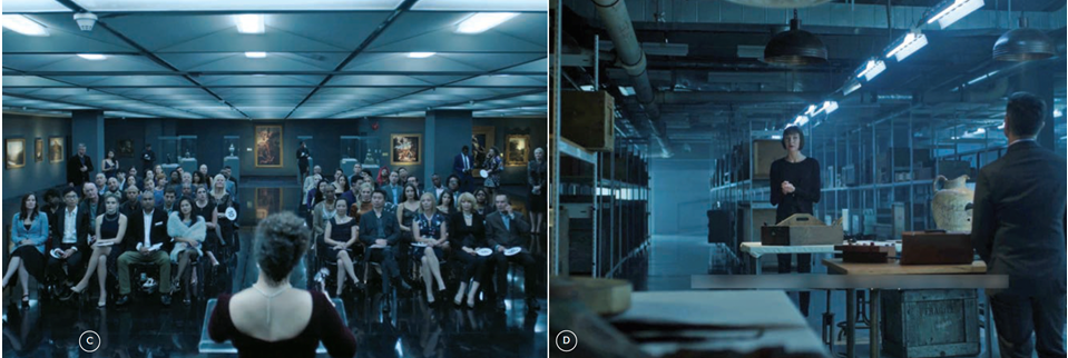
C. THE GALLERY FLOOR OF EXITER’S AUCTION HOUSE. PRODUCTION STILL.
D. EXITER’S AUCTION HOUSE BASEMENT STORAGE AREAS INSPIRED BY THE WAREHOUSE OF ARTIFACTS IN THE ORIGINAL INDIANA JONES. PRODUCTION STILL.
Multiple disturbing scenes of a strained family reunion would be shot in a padded cell. Victoria’s cell had to belong to Saint Teresa’s architecture, so I designed it as a former chapel room with renaissance-style murals on the ceiling and gothic arched windows with bars added, now mostly covered by grungy vinyl padding. Victoria’s possessor, known only as ‘Mother,’ lurches between catatonic and violent, turning on a dime, her theatrics both cunning and repellant. So I wanted the space to have an almost stage-like quality, simple and Shakespearean—yet filthy and upsetting. Who would clean a room with a demon locked inside of it?
Her adult children, that’s who—the only ones powerful enough to try. Daimon, now an ethics professor, learns from Dr. Hastings that some patients have escaped, killing a guard on their way out—and the wall of his mother’s cell now features an unknown glyph, drawn in blood.
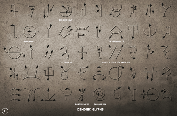
E. AN ANCIENT DEMON LANGUAGE INITIALLY DRAWN BY DESIGNER TODD FJELSTED AND LATER REFINED BY ASST. ART DIRECTOR SEAN GOOJHA, SEEN THROUGHOUT THE SERIES AS OMENS PORTENDING THE ARRIVAL OF VARIOUS CHARACTERS FROM THE COMICS.
He knows he has to call his estranged sister, who he has barely spoken to since the horrific events of their childhood. Ana now lives in San Francisco, running an elite auction house that specializes in ancient weapons of war. Here she attracts the worst of humanity, luring them into a trap where she and her cohort Chris Yen await, like glamorous spiders in a high-tech web. Exiter’s Auction House (another Easter egg) was designed to match their banter as a modern, tongue-in-cheek take on Raiders of the Lost Ark: hundreds of artifacts and artworks stored in a slick warehouse of packing crates and tall rows of shelves. It also featured temperature-controlled glass storage rooms, a modern auction floor, a luxe bar area and a rooftop garden with fire pits overlooking the city. The basement housed a secret vault for items of supernatural origin, including Ana’s childhood jewelry box filled with tokens and trinkets; gifts from her father. Or as we would learn, from his many victims.
Ana reluctantly joins Daimon in Portland to find out what is happening with their mother but they are too late—the escaped patients are seen the night before, breaking into a mausoleum in Colma, California, known to locals as the City of the Dead.
Here they would meet the first villain, the demon Basar, who wishes to be reunited with his Mother, the ancient demon who possesses Victoria Helstrom. Basar’s remains have been held tight by a Keeper (a fallen demon who protects humanity). This particular Keeper has kept Basar asleep for centuries inside its sealed sarcophagus.
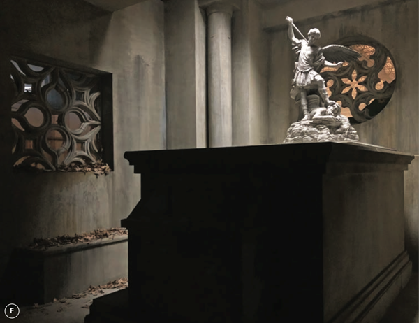
F. A MAUSOLEUM SET USED ON LOCATION AND ONSTAGE, LEADING TO ANCIENT CATACOMBS BELOW THE CEMETERY. SET PHOTO.
The mausoleum would be shot both on location and onstage. Inside was a tomb rigged for the trespassers to pull heavy chains, sliding away a stone statue of the archangel Gabriel to reveal a secret staircase. Under the mausoleum they find a series of catacombs (a large, multi-room foam sculpture) with a series of glyphs carved into the stone archways. Several of these glyphs would come to represent other demons throughout the series and had to be designed as such ahead of time, so I thought of them as simple cuneiform lines: spears, knives, slashes and other primitive symbols of war. In the shadows of the catacombs, the Keeper’s sarcophagus rests in an alcove untouched for centuries, its iron arms folded over itself like a huge dead spider. The elaborate surface of the sarcophagus depicted an ancient battle between good and evil: a bas relief sculpted in clay, cast in silicon and painted as rusty black iron. Twisting snakes with the heads of hellhounds comprised its faceplate in another Easter egg homage to the comics: the villainous Sons of the Serpent.
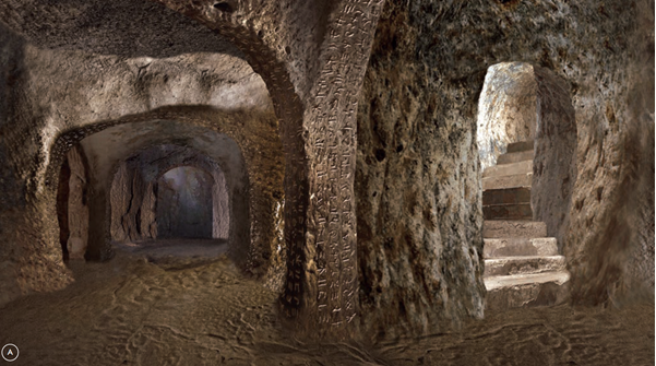
A. CONCEPT ART BY JAIME GERVAIS FOR THE CATACOMBS, A MASSIVE STAGE BUILD IN WOOD AND FOAM.
Ana gets an invitation from Caretaker, her mysterious childhood guardian, to explore the break-in of the mausoleum and its bizarre aftermath. The two find the iron shattered open sarcophagus, containing the skeletal remains of the Keeper demon, known immediately to Caretaker by its craggy one-eyed skull.
The Keeper skull would become a key character of the series (and its marketing), with its single empty socket glaring back at us, as each character bends to its dark will. There were several versions debated, drawn, sculpted and ultimately duplicated for stunts and other practical effects.
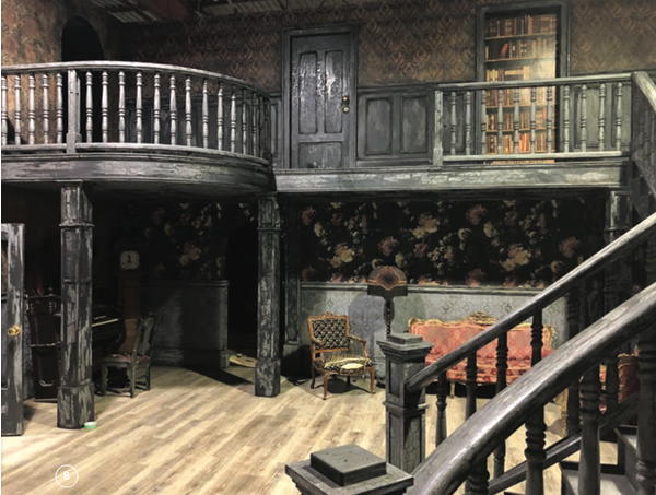
B. HAUNTED HOUSE FEATURED IN A STUNTS SHOWDOWN BETWEEN THE SATANIC SIBLINGS. SET PHOTO.
Over ten hour-long episodes, a team of amazing artists built dozens of more sets, including the Helstrom’s childhood home: a sprawling Victorian craftsman identically matched to a location for stunts and FX purposes. There was an elaborate engine room built to marry with an abandoned shipyard location, and multiple rooms to match Daimon’s wooded mid-century, split-level house. There were also several FX set pieces, elaborate inserts, and of course, ‘burn sets,’ including a visit to the attic bedroom of a possessed young boy, and a rescue mission from a burning basement. The final episode featured a haunted mansion stunts sequence—a gothic entry hall with a wrap-around staircase and an adjoined storage building, matched to an abandoned carnival location and portions of its haunted house. Breakaway railings, smashable gargoyles and exploding gallery walls—so much fun stuff for the satanic siblings’ big showdown.
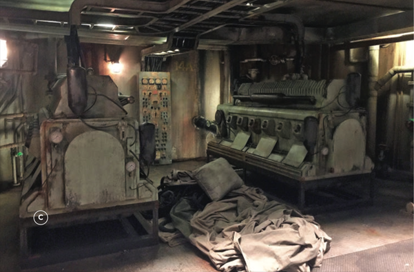
C. ENGINE ROOM OF AN ABANDONED SHIP BECOMES MOTHER’S HIDEOUT. THE EXPANSIVE SET WAS BUILT ONSTAGE WITH A STEEL STAIRWELL ENTRYWAY THAT MATCHED THE LOCATION. SET PHOTO.
Whether on stage or location, the set decoration and props teams had to create worlds with a sharply controlled visual style—but which still had to feel authentic. By turns that meant a mansion dressed as a luxury hotel showcasing Ana’s posh tastes—or a sinister, secret hotel run by The Blood, an ancient sect who keeps possessed people in comas. There was a family mortuary business, a fraternity house slaughter, several fight scenes in heavily dressed warehouses and parking decks, and various character homes visited by our X-Files-inspired investigators.
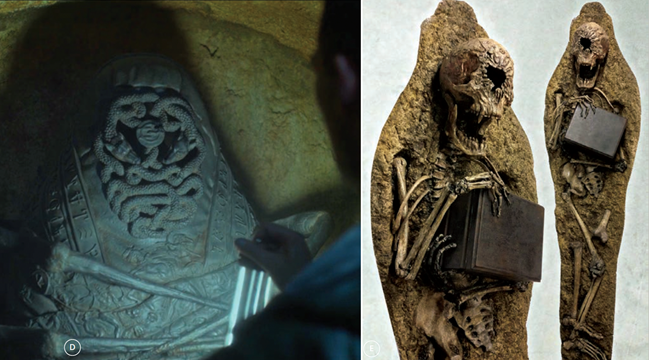
D. THE SURFACE OF THE VILLAIN’S IRON SARCOPHAGUS WAS SCULPTED IN BAS RELIEF BY SILVIU BEJAN AS AN ANCIENT WAR BETWEEN GOOD AND EVIL. THE FACEPLATE OF TWISTING SNAKES WITH THE HEADS OF HELLHOUNDS WAS AN HOMAGE TO COMIC VILLAINS, THE SONS OF THE SERPENT. PRODUCTION STILL.
E. THE KEEPER DEMON WAS SCULPTED INTO PETRIFIED EARTH, ITS SKULL REMOVABLE VIA MAGNETIC RIG AND DUPLICATED FOR VARIOUS STUNTS AS IT BECAME A KEY CHARACTER THROUGHOUT THE SERIES.
Though the events depicted were supernatural while the surrounding world was not, the show wanted to feel embedded in iconography, as with David Lynch films or vintage horror classics— as though the demons haunting the characters were everywhere. Sometimes out in the open, but often just buried in the details. Many of these details had their eerie origins in the comics but still had to feel like real moments. They had to resonate emotionally.
And that was the most challenging and exciting part for everyone on the show: wielding these dark symbols, comic book motifs and stylized settings to bring the audience closer to the characters’ struggles. In finding ways to help illustrate their emotions, maybe we could even exorcise some demons of our own
After all, we wrapped mid-March, when the horrors of 2020 were just awakening. ADG
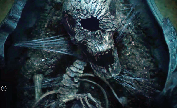
F. THE KEEPER DEMON, SCULPTED BY SILVIU BEJAN. PRODUCTION STILL.
Todd Fjelsted, Production Designer
Rick Whitfield, Shannon Grover, Art Directors
Sean Goojha, Assistant Art Director
Jordan Meyer,Ian Greenwell, Sean Pretorius, Set Designers
Jaime Gervais, Illustrator and Graphic Artist
Stephanie Ajmeria, Set Decorator
Entire January / February 2021 Perspective Issue