by Interiors
The challenge for any biographical film is presenting the life or career of an individual over the span of a couple hours. In terms of Production Design, a similar challenge exists when that film must include the various spaces that showcased their career. The nightclubs, dressing rooms and famous venues, each one with its own character and aesthetic, all contributed to the successful depiction of Billie Holiday in the film, The United States vs. Billie Holiday.
In an exclusive interview with Interiors, we spoke with Daniel Dorrance, who is the Production Designer for The United States vs. Billie Holiday. The photos, concept art and drawings are courtesy of Daniel Dorrance.
INT: First off, we were curious how the opportunity to do the Film, The United States vs. Billie Holiday, came about? What was it about it that made you want to work on it?
DD: The film first came to me in around 2015 to 2016. Lee Daniels sent me the script and asked me to see what I thought. After a quick read, I responded to him with a very excited “Can’t wait to get started”. I started researching the subject for the next week until the word came in that the producers were pulling the plug. It does happen from time to time, whether it be funding, casting or other production issues. Sometimes, the project goes down before we can ever really get started.
I put all of the research I had done on my Dropbox and moved on to the next project. So, when Lee came back to me in 2019 saying “Billie is back”, I had a nice head start.
I think it was meant to be for me to work on The United States vs. Billie Holiday as I just became available from a long project that just ended a week prior. Lee’s pitch on the story really was fantastic as well. He wanted to play it dark and moody with a side of richness, but not glorify. I couldn’t wait to get started as I love doing period films and then to add to that a Billie Holiday story was even better.
The next decision for Production was to decide where to shoot the film. After careful thought from Lee, myself and the Producers, Canada had the best incentives for the film and it came down to Toronto or Montreal. Montreal was the winner as it offered more of the old World Architecture this film needed to pull off the 1940’s exteriors.
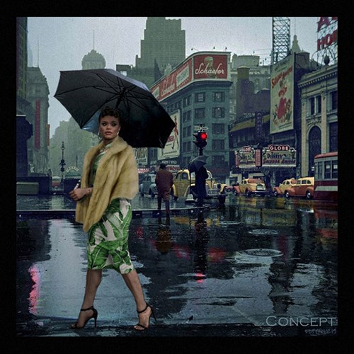
INITIAL CONCEPT CR: DANIEL DORRANCE
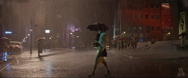
EVOLUTION OF CONCEPT CR: DANIEL DORRANCE
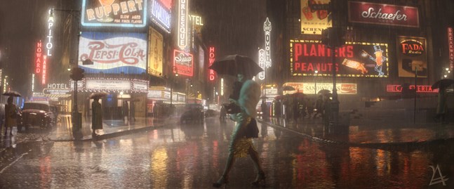
FINAL SCREENSHOT CR: DANIEL DORRANCE
INT: The Production Design for the film is masterful and features multiple locations and sets. What was the process like designing every space and historical venue? Did certain aspects change or evolve over time? Was there a specific location or set that was especially rewarding?
DD: The best description that I wanted the film to convey was “Faded Opulence. Beauty with an Edge!”. The first image I showed Lee Daniels was a concept I worked up in trying to convey the tone and palette of the film. I found a colorized photo of New York’s Time Square in the 40’s, which had beautiful greens and blacks with pops of yellows and reds from the taxis of the period. I photoshopped Andra Day (Billie Holiday) with a fur coat and umbrella walking across the street in the shot to bring into our story line and showed Lee. He was blown away and told me “That’s it, that’s the feeling.” He ended up loving this shot so much that he found a place in the script for it. We now see Billie wandering the streets looking for drugs with this epic cityscape behind her. We also printed posters of this image and put them in all the key department heads’ offices to help everybody stay in the vibe. The Production hallway was covered in the films’ research boards on every subject in the script, so anybody who came through the office for the first time would be immersed in the film history.
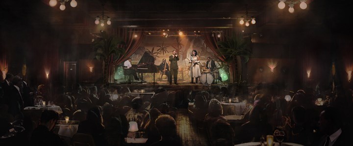
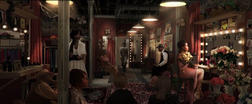

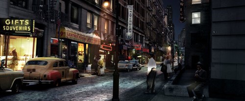
CONCEPTUAL RENDERINGS CR: DANIEL DORRANCE
Once the scouting began, the first thing we needed to nail down was the venues. All of these potential locations had very busy schedules and we needed to make our choices and get them booked. We had 6 different clubs (including Carnegie Hall) and in some cases, dressing rooms to go with them. The hardest of the bunch was Café Society. This set, per the research, had some very specific wall murals and it needed to have the right floor space to play the scenes as scripted. So in the end, we built the Café Society club and dressing room on stage which was great because it gave us the time to get it right and not be beheld to a location.
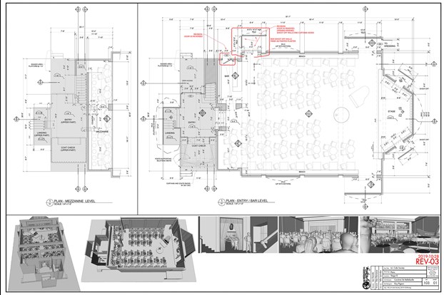
FLOOR PLANS (CAFÉ SOCIETY) CR: DANIEL DORRANCE
The location scouting process always brings surprises along the way and with that, things evolve. For example, the scene where Billie comes across the woman hanging from a tree. The scene was scripted as Billie exits the bus and wanders into the brush for privacy and sees a hanging body. The location team found several locations for this description, mainly looking for the right tree. We ended up with a mash up of 2 locations on this list. The first had a great tree with a burnt down house next to it and the second had a standing house next to the main tree. After reviewing this with Lee, he came up with the idea for what’s in the film. Billie sees the aftermath of what was a hanging and sees the family and then reacts and goes into the house and goes room to room. I then had the idea to purchase and bring the burnt house from the other location and add that to the set with the burning cross to help show the severity of this event.
The scouting process on a film like The United States vs. Billie Holiday that is 95% location-based is so important and the locations shape the look of the film. This is one of my favorite steps of not just this film but any project I’ve designed or Art Directed as I love photography and exploring new places!
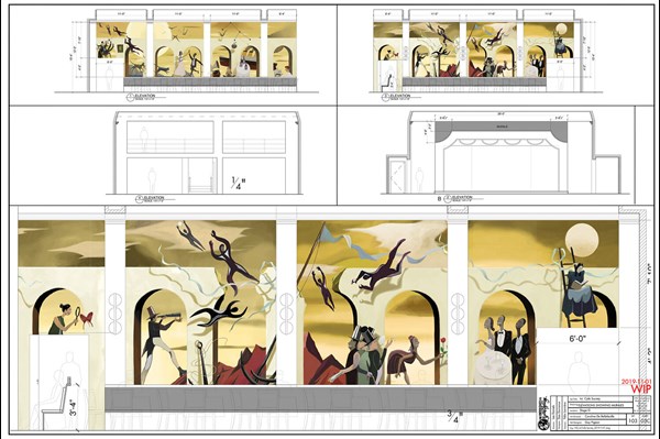
ELEVATIONS (CAFÉ SOCIETY) CR: DANIEL DORRANCE
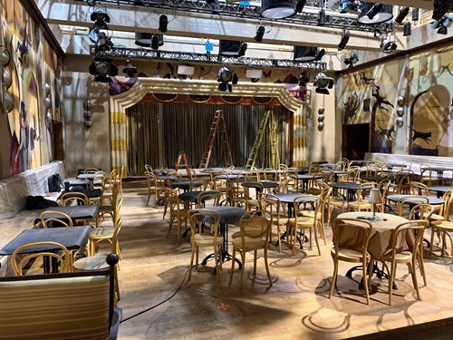
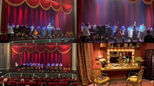
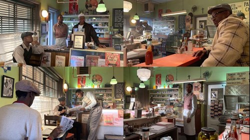
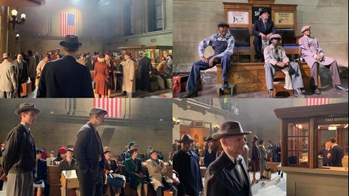
SET PHOTOS CR: DANIEL DORRANCE
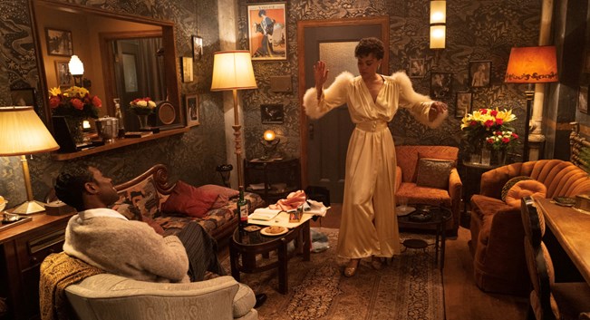
SET PHOTO CR: DANIEL DORRANCE
INT: The details of each space, specifically the dressing rooms and clubs, are a feast for the eyes. How much historical research and preparation went into these locations? What was the process like working with Set Decorator, Elise de Blois?
DD: The dressing rooms were most definitely my favorite sets on the film. We tried to make each interior iconic and each of them a sanctuary where Billie could be comfortable. We started this process with the costume color and worked from there on the color of each room so Billie would stand proud from the walls. In early talks with our DOP, Andrew Dunn, he and I pitched to Lee on keeping the background colors darker so our characters would sort of float from the background. Lee loved this idea as it played into his early thoughts conceptually.
Elise De Blois, our Set Decorator, then went to work on bringing in fantastic wallpapers and the different furnishings that made these interiors come to life. We didn’t find too much specific research on each of these dressing rooms which gave us creative license to run with the locations we chose and the specific color palettes. Elise and her team really shined in all of these sets. The layers were deep with detail from the flowers, which Lee could never get enough of, to the personal pictures of Billie and her dogs pinned to the mirrors or walls and even a lone pineapple that was found in a research picture of Billie in her dressing room.
Elise and I had a great short hand on this film and she brought great ideas to the table and her “Don’t Panic” demeanor was wonderful on days when Lee would throw us a curveball on any given morning when a new set was to be shot.


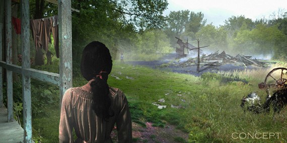
CONCEPTUAL RENDERING CR: DANIEL DORRANCE
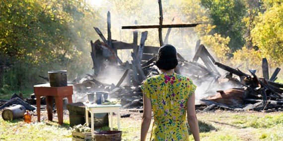
INT: During one sequence in the film, Billie Holiday (Andra Day) witnesses a lynching outside of a home and then proceeds to move through various rooms until she finally ends up on stage singing “Strange Fruit”. In terms of Production Design, what was the process like designing and choreographing this powerful scene?
DD: I touched on this earlier on how this scene came to be, so once those decisions were made, we had to get to work on pulling it off. The cabin was an empty shell so that gave us an open canvas for the layout. I did a couple of quick sketch layouts of potential floor plans and talked it through with Lee and Andrew and from there, we came up with the path that Billie would take from A. to B. The other tricky part to this walk was figuring out how to make room for the steadicam operator. The stedicam operator is leading Billie as she walks through all of these spaces and the operator is walking backwards from the beginning to the end of the shot.
This required construction to have the walls come in and out as the camera and cast would enter and exit each given hallway or room. The cabin wasn’t very big in the end and because this camera shot was done all in one take, all of the moving of walls and furniture was done in real time by stand by technicians. This choreography was worked out in fine detail on the day with cast and crew. In any given moment, a technician may have seconds to slide something back into place before the camera would pan back around to the area from which is just came.
I love these movie making moments when all of the different departments come together and create a seamless visual. Also, the day we shot this scene was very emotional for everyone as you could imagine. I stood on set watching the monitor of the scene play out in real time. You could hear all of the dialogue and the crying of the family outside of the cabin. The emotions from the father, the children and Billie stumbled from room to room and everybody around the monitor was in tears. I get goosebumps as I write this paragraph even now.
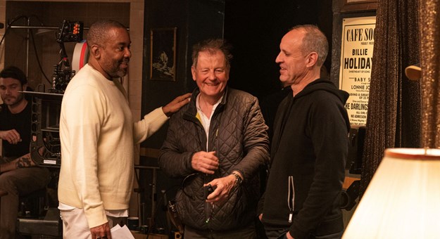
LEE DANIELS, ANDREW DUNN & DANIEL DORRANCE
Daniel Dorrance is a Production Designer and has worked on various Films.