written by Seth Emmons, Leitz
The Terminal List on Amazon Prime follows SEAL Team Commander James Reece played by Chris Pratt as he struggles to cope with the ambush of his team and his resulting head trauma after returning to civilian life. Cinematographer Armando Salas, ASC weaves a series in which the plot and the character both unravel before our eyes. Salas discusses his lens and camera choices as well the creation of a unique look through aesthetic choices and modern lighting tools.
Seth Emmons: How did you first get involved with “The Terminal List”?
Armando Salas, ASC: Showrunner David DiGilio and I worked together on the Paramount+ series “Strange Angel” and he approached me when “The Terminal List' came onto his radar. Antoine Fuqua was already attached to direct the pilot and David connected us. Antoine and I spent over an hour on the phone talking about the story. There was so much potential for dynamic image-making, especially in regard to the head trauma suffered by Chris Pratt’s character James Reece and how it affects his memory. The goal was to be as visceral and subjective as possible. By the end of the conversation we were really excited about the possibilities. Antoine brought me onto the show and we had a great collaboration.
How did the look of the show develop?
Antoine created an extensive mood board for every scene in the pilot, although not necessarily about the look. It included military authenticity, framing, wardrobe, props, and locations. It was a very extensive dive into the pilot. My job was to narrow that down into photographic choices.
I then created my own board, not specifically about the pilot, but the overall look and feel of the show: framing, lensing, composition, and color. I presented that back to him, we narrowed that down in collaboration with DiGilio, and then landed on the look. Taking that and what I knew about the shooting schedule and locations, I started testing equipment options and decided to shoot Leitz SUMMILUX-C and SUMMICRON-C lenses on ARRI Alexa Mini cameras

You’ve shot a lot of projects on Leitz cine lenses in the past. How did your past experiences factor in your lens and camera choices here?
When I start a new project I like to look at different options, but I don’t automatically eliminate lenses that I already know well or have used recently. I like to be a completely blank slate and get informed by the script, the director, the producer, the showrunner, whoever the key creatives are, and let that inform the gear decision making.
For “The Terminal List” there were a number of factors that went into choosing the SUMMILUX-C and SUMMICRON-C lenses as well as the Alexa Mini. We would be shooting under really tough conditions: mud, dirt, mountains, oceans, sand, water. Everyday the crew and the gear were just being assaulted. We’d be cooking in the desert one day, knee-deep in the ocean the next, on a boat the following day. I needed to understand the camera well, from the sensor to the accessories to the power consumption, and be confident in what I could achieve in the lensing. After a round of tests at Otto Nemenz, I landed on the combination of Leitz lenses and the ARRI Alexa Mini.
How was it mixing the SUMMILUX-C and SUMMICRON-C lenses?
In my camera tests, the Luxes and Crons matched really well; the biggest difference, other than the T-stop, is how they handle veiling glare. One is not better or worse than the other, but they are definitely different. On “The Terminal List,” I used a 1/4 Tiffen Black Satin in front of the lens when shooting close-ups, but would pull it as necessary. I regularly put the lenses in challenging situations shooting into either wraparound backlight or a very bright, halated window source. Without diffusion you see how the lens behaves with veiling glare.
For example, we could have two cameras at 45 degrees to each other and place a 29 mm Cron on one camera and a 40 mm Lux on the other to help “match” how they interact with the light source. Having both sets of lenses allowed me to tweak the lensing in the moment based on the different ways they handle halation and flaring. Intercutting in post was seamless.
Can you talk about the overall look in more detail?
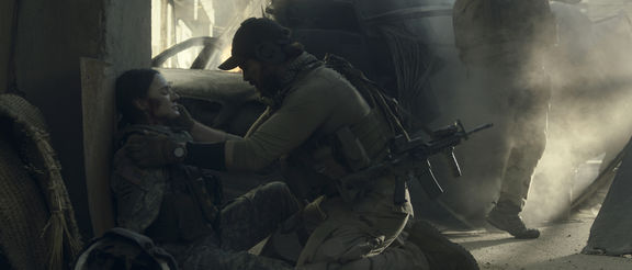
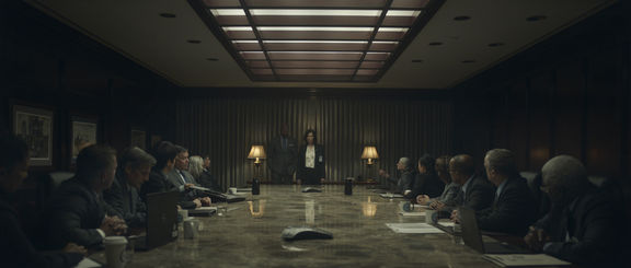
We planned to have a constrained and limited color palette, but I didn’t want to achieve that by overly manipulating the LUT. We wanted to stay true to the military colors, the environment, and earth tones: khaki, brown, green, cyan, dark grays. We avoided white and black as well so we could always dig out information in the bottom end of the curve. Then we stripped away everything else in front of the camera, most importantly the color red.
Why take away the color red?
His daughter’s red cape is a key wardrobe element. Once she is killed, Reece has this core memory of her that keeps recurring, each time a bit different as it is transformed and interrupted by other memories and flashes of violence. As that memory evolves and changes, the audience get bits and pieces until he finishes his mission in the finale. Then you get to experience the full memory unobstructed and realize it’s about the loss of innocence and the acceptance of mortality.
We associated the color red with this core memory and memory conflation in general. Basically it’s an easter egg or visual conceit that anytime there is a red prop, red wardrobe, red anything other than stoplights and stop signs which you can't take away in the real world, you know you’re in a conflation. There’s a red baseball cap in a scene in Iraq that opens up episode 5 and you later realize that character was not true to that specific memory. Or, he has a moment in episode 3 where we did an in-camera transition to a flashback when his wife was pregnant and they’re sitting on a red sofa. That memory is transformed by the core memory.

Can you speak to how the story has impacted your lens and camera choices on previous projects?
Each show has a different path to get to that choice. For instance, “Raising Dion” is a show about a child with superpowers and the director really wanted to have an intimate character drama of mom and child against the larger landscape of superpowers and super characters. I felt large format would be ideal for that. I tested the ARRI Alexa LF with Leitz THALIA lenses composing in 2:1 for UHD. At the time I could only get one set of Thalias because they were so new. But, in testing the camera I saw that the large image circle of the SUMMICRON-C lenses actually covered the LF sensor in 2:1 and fell in love with the falloff in the corners. They were sharper and cleaner in the center without being harsh on skin tones, and then in a very natural way fell off on a sensor that those lenses were never designed to cover. I ended up shooting 98% of the show on the Crons and just used the Thalias for the big VFX shots. That choice came from both planning and discovery and then choosing what looked better for the show.
For season 3 of “Ozark” we moved to large format. We completely rebuilt the look of the show that season. In addition to large format, we went to on-set HDR, so we were creating HDR LUTs for our new camera platform, which was the Sony VENICE. Again in this case we relied on the large image circle of the Leitz SUMMICRON-C lenses to cover the sensor for our clean baseline look. The color and tonal range of the show is a bit austere so we used rehoused Leica Rs and the 50mm Leitz M 0.8 Noctilux as our character lenses to soften the image. The combination of those lenses on the large format sensor achieved a really smooth, creamy skin tone, whereas our LUT and Live Grain combined to give us grit and texture. We found this beautiful balance for a gentle rendition of faces while maintaining a mood and tone full of underlying dread.
Season 2 of “Strange Angel” was set around the race to make long range rockets during WWII, and the guys who started JPL [NASA’s Jet Propulsion Laboratory]. One of which had a sex cult living in his mansion while working in a clinical engineering environment with military contracts. We created a language for the two worlds he inhabited. I did a lot of testing on vintage lenses and chose Panavision P Vintage for the cult scenes and Summicrons for the more formal look of the military world. I knew I wanted a cleaner, modern lens that would still work in this period piece and be able to cut against vintage glass. Again, even though they’re clean and modern, the Leitz lenses are very gentle. The focus curve falls off gradually and they render skin tone naturalistically. On a Super 35 sensor the Summicrons perform completely differently than they did on a large format sensor.
As a former gaffer I imagine you are very excited by the developments in lighting in the last decade. What does your lighting kit look like these days?
Definitely. It has changed the way I work by giving me so much more control on set. On “The Terminal List” the only conventional lights we used were traditional 20Ks and 18Ks for firepower. Otherwise it was 100% intelligent lighting. There’s nothing with a truer color rendition than a tungsten filament, and when you need a lot of light they’re still the best approach in my opinion. But, the time it would take to get the nuance and color that I strive for on a shot by shot basis would be unattainable because of time constraints.
The benefits of modern LEDs are speed, accuracy and the look, especially if you’re having to match different fixtures. We regularly use Kino Flo FreeStyles and Selects, lots of Astera products, obviously LED ribbon and LiteMats from LiteGear, SkyPanels and Orbiters from ARRI, EPC Lustr leko lights, and many more. Whatever the situation requires.
During prep my programmer takes all the tools that we’re going to be using and unifies their color temperatures. During production I might say “I want to fill with a leko into a bounce at 3800K, and then we’re going to do this edge light over here at 2900K.” What he’s plugging into the DMX board might be a different number, or might be a preset that he’s built for 2900K, because he’s already figured out how to make all of these different manufacturers’ tools work together consistently in a way that he knows I will like. This kind of prep saves a lot of time on set.
Also, because of the nature of our schedules, we might be shooting two continuous moments months apart. We can simply bring up a recorded cue based on the scene number and match colors instantly. Obviously in the past we would do this with the use of gels (and copious notes), but it’s a more painstaking process. For me, working with intelligent lighting is about efficiency, accuracy, and bringing an elevated sophistication to the image making.
Intelligent lighting was built into a key set piece of the pilot; the Engram clinic where Reece goes to get an MRI and is nearly assassinated. Production designer Warren Young had designed the set to be lit by architectural LED lines which created geometric patterns. He and I worked together on fine tuning the placement so they could do the majority of the lighting. Then the art director, gaffer, rigging gaffer, and their crews collaborated to install thousands of linear feet of LED ribbon. In the end, we only had 6 “movie lights” installed on this massive set; Arri Skypanels rigged over vents in the main room.
We created color cues for different moments: Reece’s consultation with the doctor, when the MRI is starting, and when he’s in the machine before he’s attacked. For the shots inside the MRI we surrounded him with pixel-mapped LEDs that we would chase, change color, and flash as he’s reliving his trauma of the ambush that killed his men. So now we’re talking about several universes of LEDs creating patterns of changing color to take us to and from these bits of memory. Strobing that mimic muzzle flashes from the loyalists’ AK-47s, flashes that mimic the explosives that killed his men, firelight from when the crypt on fire, etc. It’s an incredible tool. You need really great people, especially under the time constraints of episodic. There’s limited time to install, test, and then execute on the day. But my gaffer Cooper Donaldson, programmer Jeff Horbachewski, and rigging gaffer Paul Legler made it happen.

With all these amazing tools how do you stay grounded as a cinematographer and not get carried away with all that is possible?
My driving principle is that it’s our job as cinematographer to make sure the viewer is not pulled out of the story, whether that is from insufficiently executing the image making and disrupting their suspension of disbelief, or whether it’s drawing too much attention to the shot making with style over substance. My goal is to live in that sweet spot and make sure that the audience is connecting with the characters.