by Daron James, No Film School
DP Benedict Spence details the cinematic rules behind the popular Netflix series.
Visuals are an integral part of any show, but for the series The End of the F***ing World, it’s the inconvertible lifeline to the story.
Season 1 was utterly perfect thanks to the brilliance of creator Charlie Covell’s writing. It’s based on Charles Forsman's graphic novel of the same name which follows two teens, James (Alex Lawther) and Alyssa (Jessica Barden), and wraps the feelings of loneliness, uncertainty, and the pulse of falling in love into a palpable, dark allegory. Its finale: crème de la crème. But it left audiences clamoring for more. Aptness can be one’s own detriment.
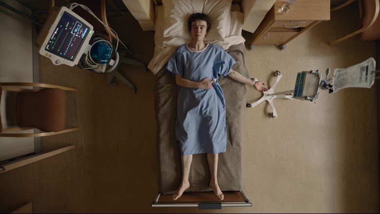
In the follow-up, cinematographer Benedict Spence, who shot the first four episodes of Season 2, lensed a simplistic visual style that subliminally spoke to the weight of the narrative. By creating rules, like center framing, avoiding establishing shots, not moving the camera during dialogue or tilting it unless it was to show perspective, it created a motif of absolute minimalism visually.
“I think limitations and rules are things that don’t reduce creativity but rather increase creativity,” says Spence, who was nominated for an Emmy for S2E2. “Once you know you can’t put someone in the frame over to one side, you’re no longer concentrating on that. It shuts down things you may obsess over on set and allows you to move on to other things like lighting or the performance.”
The cinematographer admits that establishing rules doesn’t necessarily work unless there’s a director who understands them. Lucy Forbes helmed the episodes he shot. “She knew what she wanted, what the show was, and what it needed to feel like. Without that, we couldn’t do as much finessing with the lighting or the cameras as we did.”
Central framing is one of the themes in the show which carried over from the first season. Camera crosshairs were straight on the actors’ faces, props, or locations. The only exceptions being car work or a creative decision that didn’t fit within the visual mold. Camera movement was simplified so that whenever dialog took place it would not pan or tilt other than scenes shot with a Steadicam. “Center framing is such a powerful tool. It works from a technical sense where the audiences’ eyes are in the middle of the screen the entire time, so the cut works beautifully. But creatively, it helps isolate the character so they are never too close.”
The approach parallels the story arc well as James and Alyssa are on their own separate islands of personal bane trying to figure out the next stage of their lives. It's coupled by the rainy, desolate backdrop of the locations which were found in the woodsy area of Wales in southwest U.K.
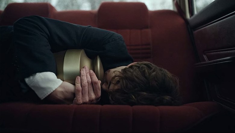
Shot on an ARRI Alexa LF Open Gate with a 16:9 crop, even lenses were kept at a minimum. Primes alternated between a 35mm, 50mm, and a 65mm. Only a single shot used a 29mm focal length—that being a scene where James finds himself in the backseat of his car clutching the urn of his father’s ashes. (Ooops, late spoiler alert.) A Zeiss Cinema Zoom 28-80mm T2.9 was instituted “when a character is ‘in their thoughts’,” or in times of “flashbacks, dream states, or voice-overs.”
Lighting added nuance to the characters, often reflecting their current state while illuminating their surroundings.
“The show is about light and shadow,” says Spence. “It’s about the darkness on peoples’ faces as much as it is about the light.” The cinematographer mixed natural lighting with practical sources while avoiding too much backlight. “We used maybe one or two fixtures on the talent’s face, spending most our time getting that one light in the exact right place.”
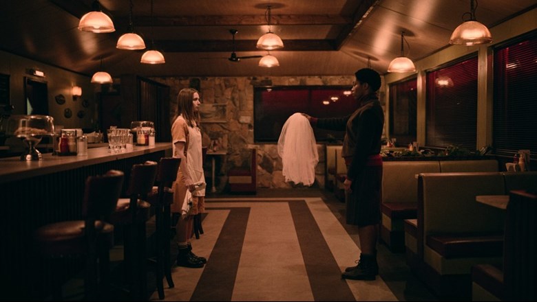
For exposure, the Alexa LF was set to ISO 1600, giving images about the same noise level as ISO 800, but almost an extra stop of latitude in the highlights shooting ProRes 4444XQ. Spence set his light meter to ISO 2500, underexposing by a half of a stop on top of the ISO 1600. Then a LUT created by colorist Toby Tomkins was added which brought everything down one stop on the monitors. “I’m keen to give the directors a ‘dark and moody’ picture, but still to get a reasonably dense exposure,” he says.
White balance emulated a slow daylight film stock, where day interiors would have neutral white palette coming through the windows with tungsten practicals glowing inside. The camera was set to 5600K for interiors so that daylight was neutral, tungsten was warm, and fluorescents were green. All interiors, like for scenes when Alyssa herself confronts Bonnie (Naomi Ackie) or when James finds himself alone in a guest room, the cinematographer went with a “tungsten wash” where a warm feeling overtook the frame. Almost all interior lighting in the show was kept warm and the white balance very rarely changed.
For night exteriors, or when windows were open in the evening, blue hour came into the fold. “There were occasions when we could shoot real blue hour, but when we had to cheat it. We would combine gelling the windows with a combo of 1.2ND and full blue,” he explains. On flat day exteriors, the DP would extend real dusk a little by setting the Alexa LF at 4000K and “underexpose it a touch to cheat the look” or bring it down in post.
When it came to adding fixtures, lighting was always motivated and took few liberties. “We stripped back all the lighting. In the first week, we had an 18K and then got rid of it because we knew we were never going to use it,” Spence says. The cinematographer’s approach combined basic lighting tricks with available light.
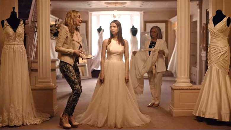
In the opening scene (S2E2), Alyssa is trying on a wedding dress. The actress was placed so that she was near the available light via the window and a 2K was placed in the ceiling behind her to accentuate the practicals. “Everything we did was barebones,” Spence adds. “It’s partly form following function because we had no real prep time, pre-light time, or budget.”
What stands out about the series, besides the writing, is when the cinematographer breaks those rules he so closely follows. In one instance, Alyssa is standing on a bridge telling us about her current emotional state, that, “She’s okay and doesn’t really feel anything anymore… That it’s good not feeling. It’s like a superpower.”
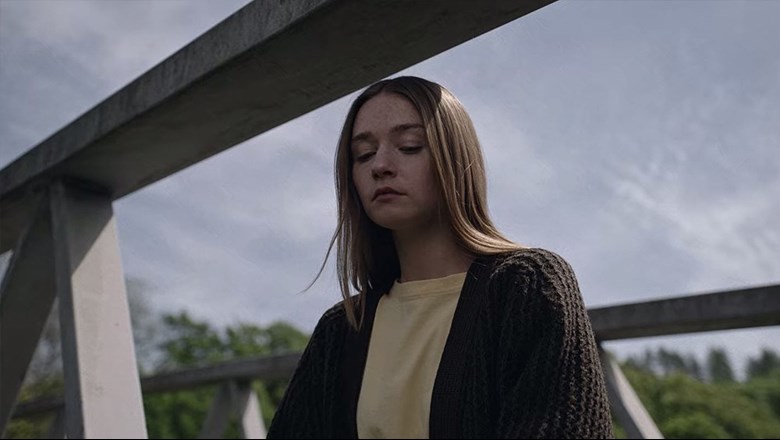
Instead of placing her center frame, the camera angle is slightly to the right with a lower eyeline. It suggests control, but yet uncertainty in her character—even though she might believe what she’s saying is true, deep down, it’s not.
Another scene is the aforementioned spoiler alert where James is clutching his father’s ashes, which happens to be one of Spence’s favorite scenes. “It’s the only shot where we used a wide angle lens. Using it gave us a tiny bit more impact for that moment,” he continues. “When you have strict rules and break them in very simple ways it can have a big impact on the audience.”